

Elite Recruiting and Performance
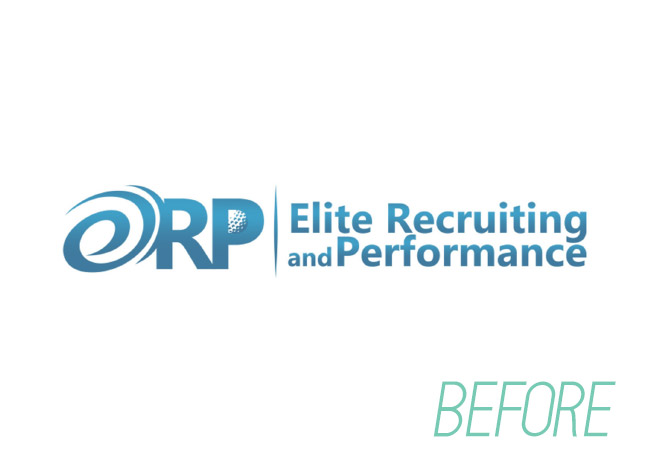
The cheap and easy road does not lead to quality and results. Tragically, this client went to an online freelance site, e.g. Fiverr.
Elite offered professional grade training to parents of students seeking golf scholarships. These were high ticket clients, and lowest bidder work wouldn’t cut it. Freelancer ignored basic design principles:
- Lacked one point of focus; spiral fought with diveted “P”
- “E” was illegible as a letter
- Depicting a literal golf ball in letter “P” would not translate to smaller scale
- No hierarchy; icon(s) and type were equal weights
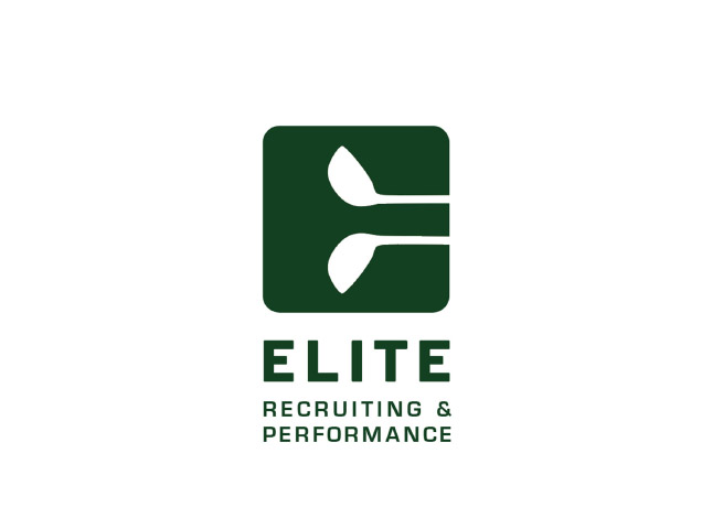
Our solution had a singular icon that sported golf clubs knocking out the negative space to form an “E”. Focus was prioritized top down, from icon to name. Green was an obvious choice, not just for grass on the course, but also the jackets presented to professional golfers.
Client: Elite Recruiting and Performance
Category: Logos