

Cookeville Dental Website
A visit to the dentist can be scary. Their website was not helping.
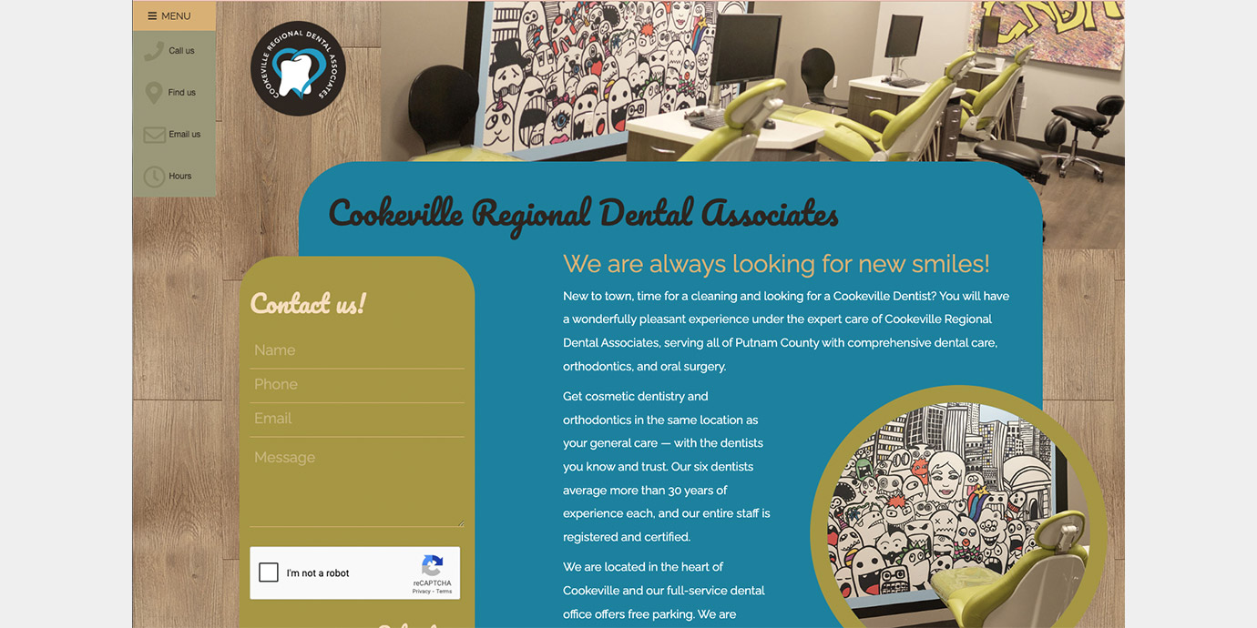
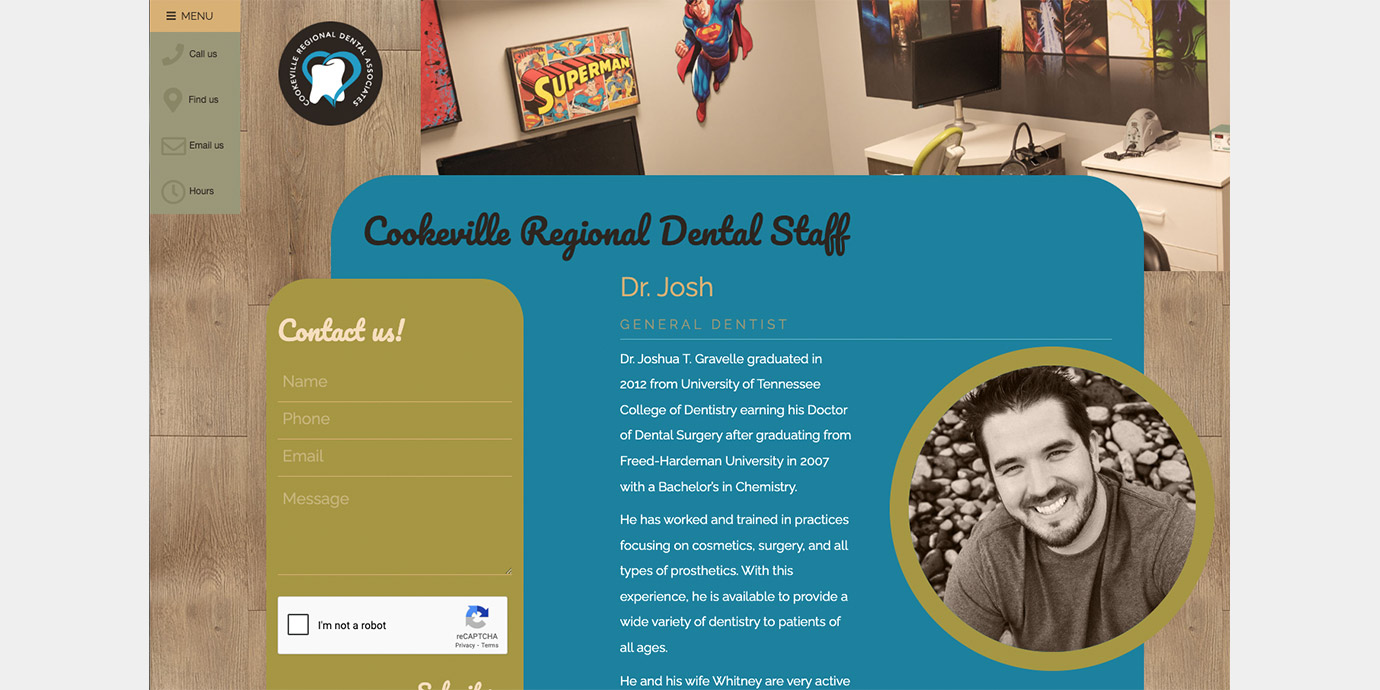
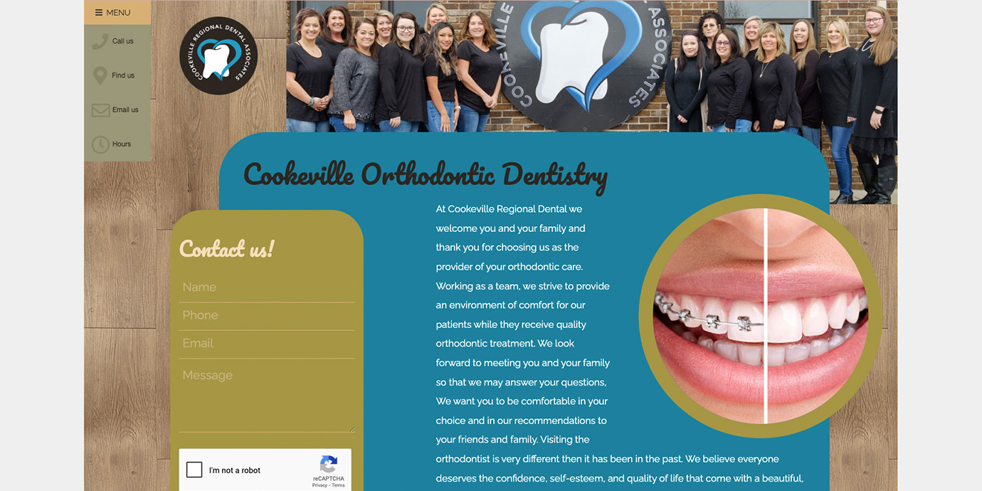
Cookeville Regional Dental Associates had a site with sharp edges, plus a black and RED color scheme. Neither welcoming nor reassuring. Upon brand discovery phase we were impressed with the personable, unassuming staff. Although apprehensive, a professional photographer was brought in under our direction to capture the personalities. Plus we took photo samples of the walls, carpet, even grain of floors and cabinets. Colors of the walls and grains were incorported into the site design. Even if it’s subconscious, seeing consistent colors and authentic (non-stock) photos on a website before an appointment helps build trust.
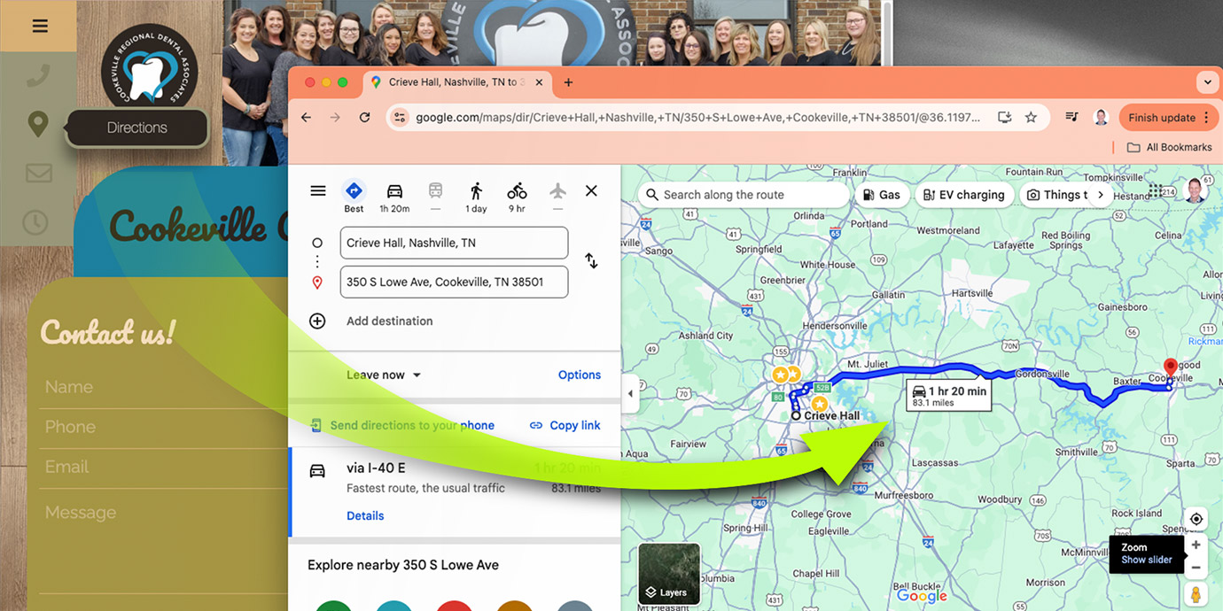
While Cookeville is a small town, there are many students at Tennessee Tech that may be unfamiliar with the streets. Therefore we programmed the site to detect wherever one is and deliver a map with directions to the practice.