What makes a good logo?
Trying to explain everything we do in one image is an abomination like Frankenstein’s monster; sewing pieces together that don’t belong.
A good logo should have ONE focal point.
Is your logo trying too hard?
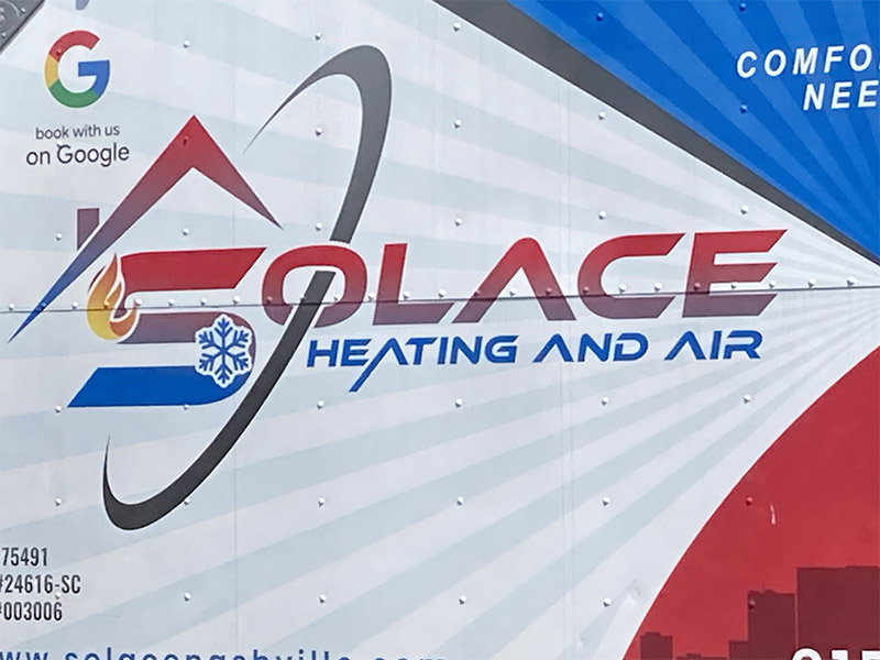
An HVAC logo on a work van. This noisy execution needs some breathing room; white space around logo would let your eye know where the logo is. Does the swoosh communicate anything about our benefits/value? Is the roof/chimney necessary? We should remove elements right before the point of losing memorability. A good logo should be able to studied for ≤ 7 seconds and easily redrawn from memory.
Unequal thicknesses in strokes/elements conveys lack on intentionality — swoosh, roof, and text are varying widths. Why is the “A” in HEATING drop below the baseline but neither AND nor AIR? Inconsistency.
Is there a heating and air company that doesn’t use a flame and snowflake or red and blue? A good logo should differentiate us from the competition; rather than extremes, how about focusing on comfort, maybe a soft purple?
Plumbing logo on a van. Blur your eyes – is there anything distinguishable or memorable? White could be used to draw attention, however, elements dwarf the name of the company. Let’s count the elements:
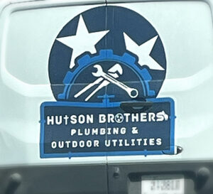
- TN stars background
- gear
- two wrenches
- cross as a “T” in Hutson
- again TN stars as “O”
- crane arm in “S”
- pipe fittings
- and spigot valve.
Canva and stock art are no substitute for a professional designer.
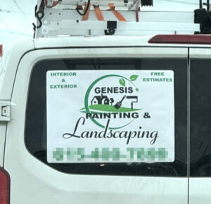
Painting and Landscaping logo on a work van. Let’s consider what is important based on scale; is GENESIS, the name of the company, 1/3 priority of the fact they do landscaping? Rather than two paintbrushes, a swoosh branch, a hill, a tree and a house, how about a singular icon?
One focus, please!
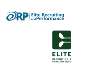
Golf Training. Client went to Fiver, however, the cheap and easy path does not lead to success. We have a swoosh (of a golf swing?) that is not clearly an “e”, the “P” contains golf ball divets (which plugs up at small scale), and we have a tapered dividing line. More is not better. Plus there’s no hierarchy, so the eye sees one blob. We crafted an icon that subtly sports golf clubs as negative space, and weighted their name, ELITE over what they do.
Other logo considerations
Does your logo lack contrast and memorability?
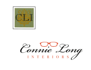
Interior Decorator. This client originally used an ornate pattern for their identity. A critical logo consideration — how would it appear as black and white? This instance would’ve been a dark mess. The owner wore orange frames that bespoke a unique, personal style; we couldn’t help but “refocus” her image.
Does your logo translate well to a smaller scale?
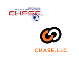
Clinical Drug Testing Company. Longitude/latitude lines fade and CONTINENTAL HEALTH & SAFETY EXPRESS fuzzes up in CHASE’s original logo at business card size. The globe suggests “international” …but they only operate in the US. We refocused color scheme to match their target market: pipe fitters and construction who resonate with hazard/safety orange. To convey the collaboration/integration with clients needing to keep good records, we chose equal “C”s interlocked like a chain. Balanced, clean, relevant.
Careful of being too trendy!
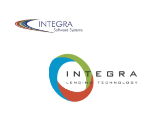
Loan operating Software. Swooshes were the rage in the early aughts. Integra’s key selling point was integration of three pieces of software that worked together natively (their competition cobbling together 3rd party solutions that didn’t always fit together). An all encompassing möbius strip made sense.
Does your logo substitute icons for letters?
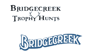
Managed Hunt Company. Repent! Replacing letters can be confusing and appear too playful. The original, home made logo sported a gun sight “O” in Trophy and “Y” as antlers. The rhythm is jarring and execution looks homemade. We selected a font that flowed, liberated from letter pictures, and tightened up the space to unify as one element.
Does your logo match your value?
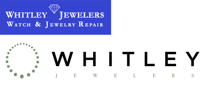
Jewelry Company. A family owned company was acquired by new owner who wanted to elevate the “pawn shop, watch repair” image to luxury. The 70yr old logo, while established and recognizable, would not resonate with high end clients who we were now trying to attract. A good logo anchors the company’s perceived position in the marketplace.